
While this section provides an overview how Controls work please see the Javadoc, which provides extensive information and examples.

Figure 1. Post Sequence Diagram - created with Enterprise Architect courtesy Sparx Systems
In Click all control classes must implement the Control interface. The Control interface is depicted below in Figure 2.
Figure 2. Control Interface Diagram - created with Enterprise Architect courtesy Sparx Systems
Methods on the Control interface include:
public class ActionDemo extends BorderPage {

    // Uses listener style 1
    public ActionLink link = new ActionLink();

    // Uses listener style 2
    public ActionButton button = new ActionButton();

    public ActionDemo() {

        // Verbose but provides compile time safety
        link.setActionListener(new ActionListener() {
            public boolean onAction(Control source) {
                return onLinkClick(source);
            }
        });

        // Succinct but typos will cause runtime errors
        button.setListener(this, "onButtonClick");
    }

    // Event Handlers ---------------------------------------------------------

    public boolean onLinkClick(Control source) {
        ..
        return true;
    }

    public boolean onButtonClick() {
        ..
        return true;
    }
}
All call back listener methods must return a boolean value. If they return true
the further processing of other controls and page methods should continue.
Otherwise if they return false, then any further processing should be aborted.
By returning false you can effectively exit at this point and redirect or forward
to another page. This execution logic is illustrated in the
Page Execution Activity Diagram.
Being able to stop further processing and do something else can be very handy. For example your
Pages onRender() method may perform an expensive database operation. By returning
false in an event handler you can skip this step and render the template or forward to the
next page.

Figure 3. Package Class Diagram - created with Enterprise Architect courtesy Sparx Systems
The key control classes include:/com/mycorp/page/Login.propertiesIf you want to tailor messages for a particular page this is where to place them.
/click-page.propertiesIf you want messages to be used across your entire application this is where to place them.
/com/mycorp/control/CustomTextField.properties
/click-control.properties
# Click Control messages
field-maxlength-error={0} must be no longer than {1} characers
field-minlength-error={0} must be at least {1} characters
field-required-error=You must enter a value for {0}
file-required-error=You must enter a filename for {0}
label-required-prefix=
label-required-suffix=<span class="required">*</span>
label-not-required-prefix=
label-not-required-suffix=
not-checked-error=You must select {0}
number-maxvalue-error={0} must not be larger than {1}
number-minvalue-error={0} must not be smaller than {1}
select-error=You must select a value for {0}
table-first-label=First
table-first-title=Go to first page
table-previous-label=Prev
table-previous-title=Go to previous page
table-next-label=Next
table-next-title=Go to next page
table-last-label=Last
table-last-title=Go to last page
table-goto-title=Go to page
table-page-banner=<span class="pagebanner">{0} items found, displaying {1} to {2}.</span>
table-page-banner-nolinks=
<span class="pagebanner-nolinks">{0} items found, displaying {1} to {2}.</span>
table-page-links=<span class="pagelinks">[{0}/{1}] {2} [{3}/{4}]</span>
table-page-links-nobanner=<span class="pagelinks-nobanner">[{0}/{1}] {2} [{3}/{4}]</span>
table-no-rows-found=No records found.
table-inline-first-image=/click/paging-first.gif
table-inline-first-disabled-image=/click/paging-first-disabled.gif
table-inline-previous-image=/click/paging-prev.gif
table-inline-previous-disabled-image=/click/paging-prev-disabled.gif
table-inline-next-image=/click/paging-next.gif
table-inline-next-disabled-image=/click/paging-next-disabled.gif
table-inline-last-image=/click/paging-last.gif
table-inline-last-disabled-image=/click/paging-last-disabled.gif
table-inline-page-links=Page {0} {1} {2} {3} {4}
# Message displayed when a error occurs when the application is in "production" mode
production-error-message=
<div id='errorReport' class='errorReport'>The application encountered an unexpected error.
</div>
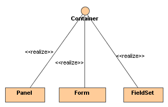
Figure 4. Containers Class Diagram
The following classes provides convenient extension points for creating custom Containers: Lets cover each of them here.
public class Div extends AbstractContainer {

    public Div(String name) {
        super(name);
    }

    public String getTag() {
        // Return the control's HTML tag.
        return "div";
    }
}
Lets try out the newly created Container above: (note the MockContext used in this test is described in the
Mock Test Support documentation)
public class Test {
    public static void main (String args[]) {
        // Create mock context in which to test the container.
        MockContext.initContext();

        // Create a div instance called "mydiv"
        String containerName = "mydiv";
        Div mydiv = new Div(containerName);

        // Add a control to the container
        mydiv.add(new TextField("myfield"));

        System.out.println(mydiv);
    }
}
Executing the above example results in the following output:
<div name="mydiv" id="mydiv">
    <input type="text" name="myfield" id="myfield" value="" size="20" />
</div>
public class FieldAndContainer extends AbstractContainerField {

    public FieldAndContainer(String name) {
        super(name);
    }

    // Return the html tag to render
    public String getTag() {
        return "div";
    }
}
To test the new class we use the following snippet:
public class Test {
    public static void main (String args[]) {
        // Create mock context in which to test the container.
        MockContext.initContext();

        // Create a FieldContainer instance called "field_container"
        String containerName = "field_container";
        FieldAndContainer fieldAndContainer = new FieldAndContainer(containerName);

        // Add a couple of fields to the container
        fieldAndContainer.add(new TextField("myfield"));
        fieldAndContainer.add(new TextArea("myarea"));

        System.out.println(fieldAndContainer);
    }
}
Executing the snippet produces the output:
<div name="field_container" id="field_container">
    <input type="text" name="myfield" id="myfield" value="" size="20"/>
    <textarea name="myarea" id="myarea" rows="3" cols="20"></textarea>
</div>
// EmployeePage.java
public EmployeePage extends Page {

    private Form form;

    public void onInit() {
        // Create form
        Form form = new Form("form");

        // Add a couple of fields to the form
        form.add(new TextField("firstname"));
        form.add(new TextField("lastname"));
        form.add(new IntegerField("age"));
        form.add(new DoubleField("salary"));

        // Add a submit button to form
        form.add(new Submit("submit", "Add Employee"));

        // Add form the page
        addControl(form);
    }
}
Lets imagine we want to create a layout using Div <div> and HTML List <ol> tags.
We could provide the markup for the employee.htm template as shown below,
using a template engine such as Velocity:
<!-- employee.htm -->
${form.startTag()}
    <div style="margin: 1em;">
        <ol>
            <li>
                <label for="firstname">Firstname:</label>
                ${form.fields.firstname}
            </li>
            <li>
                <label for="lastname">Lastname:</label>
                ${form.fields.lastname}
            </li>
            <li>
                <label for="age">Age:</label>
                ${form.fields.age}
            </li>
            <li>
                <label for="salary">Salary:</label>
                ${form.fields.salary}
            </li>
        </ol>
    </div>
    ${form.fields.submit}
${form.endTag()}
Using a CSS stylesheet, the markup above can be styled and transformed into
a fancy looking form.
There are pros and cons to using the template approach.
One of the advantages of the Template approach, is that the layout is explicit and one can easily
tweak it if needed. For example instead of using divs and ordered lists, one can
change the template to leverage a table layout.
A disadvantage of the Template approach, is added redundancy.
In the example above we created the fields in Java, and laid them out using markup
in the template.
If the requirements should change to add a new field for example, one will have to add the
field in the Page as well as the template.
It is also possible to "generify" the layout using template engines. Macro.vm is an example of a generic form layout using Velocity.
// HtmlList.java
// Create a list <ol> html element, that accepts <li> elements as children
public class HtmlList extends AbstractContainer {

    public String getTag() {
        return "ol";
    }

    // Can only add ListItems: <li> tags
    public Control add(Control control) {
        if (!(control instanceof ListItem)) {
            throw new IllegalArgumentException("Only list items can be added.");
        }
        return super.add(control);
    }
}
// ListItem.java
// Create a listItem <li> element
public class ListItem extends AbstractContainer {

    public String getTag() {
        return "li";
    }
}
Another component that will be used in the example below is a FieldLabel which renders
an HTML label element for a specified Field.
// FieldLabel.java
// Create an html <label> element for a specified Field
public class FieldLabel extends AbstractControl {
private Field target;
private String label;
public FieldLabel(Field target, String label) {
this.target = target;
this.label = label;
}
public String getTag() {
return "label";
}
// Override render to produce an html label which produces:
//
public void render(HtmlStringBuffer buffer) {
// Open tag: <label
buffer.elementStart(getTag());
// Set attribute to target field's id
setAttribute("for", target.getId());
// Render the labels attributes
appendAttributes(buffer);
// Close tag: <label for="firstname">
buffer.closeTag();
// Add label text: <label for="firstname">Firstname:
buffer.append(label);
// Close tag: <label for="firstname">Firstname:</label>
buffer.elementEnd(getTag());
}
}
Now the form can be assembled.
Continuing with the employee example from the template approach,
we again create an EmployeePage, but this time an HtmlForm and HtmlList is used to create
a custom layout:
// EmployeePage.java
public class EmployeePage extends Page {
    // A form instance variable
    private HtmlForm form;

    // Build the form when the page is initialized
    public void onInit() {
        // Create an HtmlForm which is ideal for composing manual layouts
        form = new HtmlForm("form");

        // Create a list and add it to the form.
        HtmlList list = new HtmlList();
        form.add(list);

        // Add firstname field and pass in its name, label and the list to add the field to
        addTextField("firstname", "Firstname:", list);
        addTextField("lastname", "Lastname:", list);
        addTextField("age", "Age:", list);
        addTextField("salary", "Salary:", list);

        // Add a submit button to form
        form.add(new Submit("submit", "Add Employee"));

        // Add the form to the page
        addControl(form);
    }

    // Provide a helper method to add fields to the form
    private void addTextField(String nameStr, String labelStr, List list) {
        // Create a new ListItem <li> and add it to the List
        ListItem item = new ListItem();
        list.add(item);

        // Create a textfield with the specified name
        Field field = new TextField(nameStr);

        // Create a field label, which associates the label with the field id.
        // label.toString would output: <label for="firstname">Firstname:</name>
        FieldLabel label = new FieldLabel(field, labelStr);

        // Next add the label and field to the list item.
        // item.toString would then produce:
        // <li>
        //   <label for="firstname">Firstname:</name>
        //   <input type="text" name="firstname" id="form_firstname" value="" size="20"/>
        // </li>
        //
        item.add(label);
        item.add(field);
    }
}
Now the employee.htm template would only need to specify the name of the
top level component, in this case form.
<!--employee.htm-->
${form}
which produces the following markup:
<!-- employee.htm -->
<form method="post" id="form" action="/myapp/employee.htm">
<input type="hidden" name="form_name" id="form_form_name" value="form"/>
    <ol>
        <li>
            <label for="firstname">Firstname:</label>
            <input type="text" name="firstname" id="form_firstname" value="" size="20"/>
        </li>
        <li>
            <label for="lastname">Lastname:</label>
            <input type="text" name="lastname" id="form_lastname" value="" size="20"/>
        </li>
        <li>
            <label for="age">Age:</label>
            <input type="text" name="age" id="form_age" value="" size="20"/>
        </li>
        <li>
            <label for="salary">Salary:</label>
            <input type="text" name="salary" id="form_salary" value="" size="20"/>
        </li>
    </ol>
    <input type="submit" name="submit" id="form_submit" value="Add Employee"/>
</form>
Again using a CSS stylesheet, the markup above can be styled and transformed into
a fancy looking form.
There is a live demo
showing the programmatic approach.
The advantage of the programmatic approach is that there is no redundancy. Each Field is
created and added using normal Java. There is no need to specify where the Field
must reside in the markup.
If new requirements arrive and more fields added, only the Page has to be updated.
No need to change the template as the layout is taken care of by the CSS and
markup produced by the components.
A disadvantage is that it is harder to visualize what output would be rendered by the containers.
Whether you use the template or programmatic
layout approach, is up to you. Both work well and have advantages and disadvantages
over the other.